Profile pics with punch: maximizing your social media headshot
When it comes to headshots for social media, many of us simply pick a relatively suitable photo and upload it.
But the reality is that not just any photo will do. Your photo is part of your brand, so you want to get it right!
So today I’m going to share some tips to help you make your profile photo a true asset.
Smile
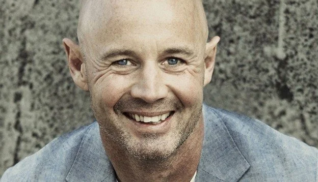
Study after study has shown that people trust and like you more if your photo shows you smiling. If you think about it, it just makes sense—we are more likely to feel comfortable with someone who smiles than someone who looks serious.
But not just any smile will do. You want it to be sincere and genuine. And you want it to match the type of social media it is on, as well as the type of audience it targets.
For LinkedIn, which is more business-like than some other social media, that means no smirk, and no large ear-to-ear grin. Try to go for a friendly, genuine, somewhat business like, but kind smile.
Facebook tends to be more informal, so a more relaxed and bigger smile may work just fine, as long as it fits with your brand.
Zoom in
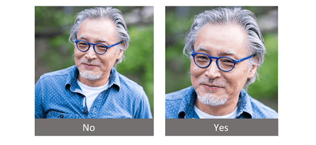
Generally, your face should fill at least 50% of the image. People aren’t interested in seeing your arms or your suit lapels—they want to see your face. You want to them to be able to see your personality (which means they want to see your eyes), which they can’t do if your face is too small.
Match the media
I mentioned above that you want your smile to match the type of social media platform your photo is on. But that’s not the only thing you want to match.
Your outfit should also fit the tone of the platform. For LinkedIn, business attire is expected. For Facebook, less formal is the norm. However, it always depends on your brand and your audience.
To illustrate, let’s say you’re a lawyer and your business has both a Facebook page and a LinkedIn page. Even though Facebook tends to be more informal, the fact that you are a lawyer means your brand is probably still “very business-like”, even on that platform. And your audience probably expects to see you in a suit. So this is a case in which a less formal photo on Facebook probably wouldn’t be the way to go.
Your hairstyle, and even the neatness of your general appearance (e.g. properly groomed beard) all contribute to the overall impression your audience will get, so make sure you pay attention to all these details.
Colour
Keep in mind the colour of your clothing. First, make sure it’s a colour that looks good on you. Second, make sure it matches your brand. That doesn’t mean it should be the same colour as your logo—it means that it should send the message you want it to. Different colours send different messages. For example, red is confident, black is serious, and royal blue is trustworthy.
You also want to pay attention to the background. For more business-like photos, make sure the background is a solid colour—avoid any patterns or objects in the background. Solid white is generally best, but you always want to make sure it is a contrasting colour to your face/hair/outfit. If you have white/silver hair or are wearing a white blouse, then you won’t stand out against a white background.
The rule of thirds
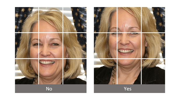
In photography, there is a principle known as the rule of thirds. The idea is that the best photos don’t have the subject in the centre, either left to right or top to bottom. Instead, they place the subject off-centre. The sweet spot is determined by placing the main focus of the photo one-third in from the edge, or one third in from either top or bottom.
For headshots, there are two focal points: your eyes. So, using the rule of thirds, you don’t want a headshot with your eyes halfway down the photo. You want them only one-third of the way down.
Don’t make the mistake of thinking “my head is the focal point so having my head on the top horizontal line will work”. It won’t, because your face will be too small (see Zoom in above!).
Image size
Not enough people pay attention to this aspect of their profile photo. The truth is, social media platforms will trim or resize your photo, and that means the end result might not be ideal. So the trick is to make your photo the size that the platform recommends. That way, no resizing will occur.
For LinkedIn, that size is 400x400 pixels. For Facebook, it’s a bit tricky. Facebook tells you to use a photo that is 180x180 pixels. However, when Facebook displays the image on desktops/laptops, it trims it to 170x170. When it displays the same photo on a phone, it trims it to 128x128. So the trick is creating a photo that is 180x180, but make sure the important part of the picture fits within the centre 128x128.
Note: The sizes I mention above are only for the headshot/profile photos – for other images (such as backgrounds or post images) the size rules are different.
Note that for both LinkedIn and Facebook, the recommended image sizes are square. That means you could get away with using one image for both. You do this by creating a square image that is 400x400. When you upload that headshot to LinkedIn, it will just use it as is. When you upload it to Facebook, it will resize it to make it smaller. But, since the end result is still square, there is no distortion—the ratio of length to width is still the same so the photo should still look the same.
Clarity
Make sure your photo is clear. Any fuzziness makes your photo look unprofessional.
Go Pro
If possible, get some professional headshots done. It’s incredible how much better these shots can be! Book a session, bring a couple of different shirts, and have some photos taken in each. That gives you a variety of photos to use, instead of always the same one.
Cheers,
Tim
Helping you engineer the business of you


